New guide to reaction time analysis

TL;DR: I just published “Reaction Time Distributions – An Interactive Overview“.

There is a big literature on the analysis of Reaction Time data. Everybody can see that reaction times are not normally distributed but there is little consensus about how they are distributed. This has resulted in many advanced mathematical arguments why one or the other distribution is better. Others propose obscure rules-of-thumb ways of deleting or transforming data so that it looks normally distributed.

Meanwhile, the average researcher is left bewildered, often resorting to some variant of the normal distribution which they know and love from other kinds of data. This is worse than any of the alternatives as would be obvious to anyone who did a proper assessment of their model fit, e.g., using a QQ-plot, a Shapiro-Wilk test, or a posterior predictive check.

I think that we need a guide so accessible that it lowers the bar just enough that people jump aboard trying different RT distributions. Long story short, I ended up writing an overview and presented it in a twitter thread:

The easy part: making it.

I myself have been bewildered about analyzing reaction times. It was only when I discovered the flexible distributional regression in brms, that I took a few alternative distributions for a spin on a dataset I was working on. The superior fit immediately did away with all the problems I had been hacking myself out of.

  • The model fits faster and more reliably.
  • You need not transform the data and you need less outlier removal.
  • The model predictions actually look like the data you are modeling.

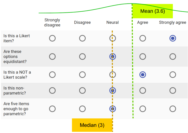
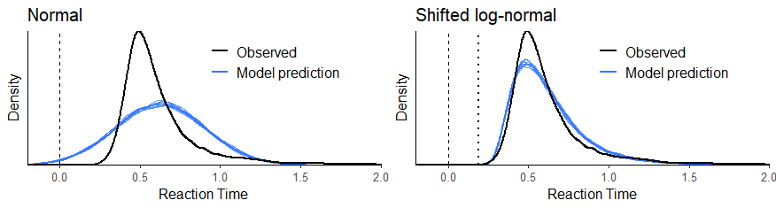
Naturally, the fit was superior to a Gaussian. A leave-one-out Cross-Validation found that the log-predictive error was halved! Here is a figure from an upcoming paper:

A few weeks later, I spent an evening checking out `shiny` to make interactive plots. Two evenings later, I had written most of the guide/overview. It was so easy. ` shiny ` made interactivity a breeze and ` brms` (and ` rtdists`) had PDFs for most of the distributions. It was just a matter of connecting the two. Another evening for the cheat sheet, and I was ready to put it online (this was the hard part; see below).

Warning: it’s also an opinion.

As the interactivity allowed me to get intuitions about the distributions myself, I grew quite opinionated because some distributions were really hard to get intuitions about.

Image result for warning opinion

Take for example the very popular ex-gaussian. The added exponential decay completely changes the mean and the standard deviation so that, e.g., μ = 0.4 secs and σ = 0.2 secs does not refer to anything identifiable in the distribution. Furthermore, the exponential parameter (λ) is very hard to understand, and in most analyses, I’ve seen it’s discounted. This means that they essentially say “all long RTs are not really RTs but something else” which I find odd. μ systematically underestimates RTs.

We want one parameter to capture most of what RTs are about, and I ended up going with the term “Difficulty” for that parameter cf. Wagenmakers & Brown (2007). I explain why in the overview, but briefly, it allows you to do univariate regression everybody does anyway. I haven’t seen this argument put forward elsewhere so I guess it counts as an opinion.

My favorites generic distributions are the shifted log-normal and the Decision Diffusion model as is also clear from the cheat sheet. Of course, people should choose on a case-by-case basis.

The hard part: hosting it.

The hard part was getting this to run on the web, which required around 6 evenings and a lot of debugging. shinyapps.io is very convenient for RStudio users, but the server shuts down after a document has been in use for 25 hours in a month. I choose to set up a shiny server using Google Cloud because they offered a year’s worth of free computing and pretty low charges after that. I followed this guide.

However, I encountered heaps of issues which I’ve explained in the document’s GitHub repo. The current solution is good enough, but some issues remain.

New tutorial on optimal decisions using Utility Theory

TL;DR, here is the tutorial!

There is a wave towards using data more and more in decision making across all levels of business and society. However, people often use data quite informally: look at an Excel sheet or a graph, then make a decision based on your impression. This often works well, but it can be fragile because of our many deep-skin biases as well as a general poor ability to reason about quantities and complex interactions.

Decision theory to the rescue! By adding a few axioms to the basic axioms of probility theory, we can extend statistical modeling to make decisions which maximize utility – whether that utility is happiness, profit, health, public support, or something else entirely. I’m not saying that we should blindly hand over decisions to algorithms, but seeing their limited-worldview pure-quantitative solution can be a nice decision support to keep some of our biases at bay.

I was motivated to write this tutorial to fill in a gap: there is a lack of practical entry-level guides that scale well to complex problems. The entry-level here is someone who just want to update an Excel sheet with new data, and see how that changes the decision. Here’s the accompanying twitter thread:

I made a first draft of this for an elective course in the fall. Then a second draft for my presentation at the Bayes@Lund 2019 conference. And now I finally got to brush it off. OK, I become overly excited when I get to talk about Bayesian inference AND utility at the same time:

Jonas Kristoffer Lindeløv: extending bayes to make optimal decisions

Do We All Have “Impaired” Awareness of Our Abilities?

This is my poster for Neuroscience Day 2019. It is quite provocative, and there are nuances to this story:

  • This is likely a sort of Simpson’s Paradox in reverse, where there is little sensitivity to objective performance within groups (patients vs. healthy), but some sensitivity between groups.
  • I do not dispute that subjective reports reflect real subjective experiences. As such, measures on Quality of Life, emotional distress, etc. are not to be disregarded. But care should be taken to generalize from, e.g., reports of emotional distress to impacts on real abilities.

I do have a very nice dataset coming up from 124 respondents, where we improved substantially on the methodology, e.g., by asking participants to rate their performance in percentiles rather than on an ordinal scale. I plan to merge all of this in a paper.

I used a poster template and design idea which you can read more about in this Twitter thread. This was very much a last-minute panic. In particular, I’d liked to have worked more on the “ammo bar” to the right, but you only have so much time!

Don’t hesitate to contact me and let me know what you think:

Click to download PDF.

Scanner radiation caused 1% of flight-related cancers.

After extended public anxiety about cancer risks associated with back-scatter scanners, EU and U.S. banned them in 2012 and 2013 respectively. But how many people actually developed cancer from these scans before they were banned?

I have yet to find articles that estimate the world-wide mortality using consensus numbers. Most just state that the risk is “negligible” or “truly trivial”. That vague language is not comforting to a pedantic like me, so let’s look at the actual numbers. See the end of this post for a full list of sources and informative infographics.

Risk per scan: 0.3 millionth of a percent

The risk that an individual develops cancer when exposed to 1 microsievert of radiation is around 0.0000041 % for adults. The risk increases approximately linearly with radiation, so four scans quadruples the chance – not more and not less. The risk is only slightly higher (0.0000057 %) when including children, elderly, and heritable effects.

A typical back-scatter scan exposes you to 0.07 microsieverts of radiation (Multiple sources: see end of post.)

Multiply these two numbers and you end up with an elevated risk-per-scan of 0.07 * 0.0000041 % = 0.00000029 %.

Risk due to other radiation sources on your flight

The effect of a single scan exposed passengers to about as much radiation as being outside on the ground for 10 minutes or inside a flying airplane for 1.5 minutes (around 0.07 microsievert). This is due background radiation (most importantly cosmic radiation, i.e., the bombardment of particles from outer space, which decays into X-rays and other stuff when colliding with our atmosphere).

I leave it as an exercise to the reader to figure out whether scanners or background radiation constitute the largest risk factor for cancer on typical flights.

Scenario: camping in a scanner

If you want to increase the chance of developing cancer at some point in your life by 1% (one in a hundred), you would have to find one of the old back-scatter scanners and camp in it for four months straight, 24 hours a day. Every time you leave for the loo or to stretch yourself, you’d have to go back in and stay longer to compensate. And you’d have to have done it before 2013, because they are really hard to get now. Good luck on your adventure.

Image result for MR scanner sleep
Your home for the next four months.

What if we multiply by a few billion?

Even minuscule effects on individuals add up when they apply to a large number of people. In 2012, there were roughly three billion passengers who spend on average two hours per flight, totaling six billion hours in-flight.

Image result for gif passengers plane
Three billion passengers.

If all of them went through one back-scatter scan per flight, the result is that:

In 2012, 8.3 passengers developed cancer because of airport scanner radiation. 664 passengers developed cancer because of the background radiation in-flight but 95 of these would have developed cancer for the same reason anyway, had they stayed on the ground for the same duration. An additional 601 passengers developed cancer while commuting due to “normal” non-flight-related ageing and risk factors.

Sources: see end of post.

That is, scanners, background radiation, and ageing caused 767 cancers of which scanners make up one percent. The numbers above contains some estimates and could be off by a factor of two, i.e., between 0.5 and 2% of flight-related cancers were due to the scanners.

Risk of cancer after back-scatters were banned

In 2017 there were roughly 4 billion passengers, so while modern scanners should cause virtually zero cancers, 918 passengers developed cancer because of background radiation in-air and 832 simply due to regular ageing.

In comparison, 7.28 million of these 2017-passengers would develop cancer in the same year anyway, regardless of whether they flew or not. Flying only added one in 8,000 to that number.

Morale: statistical illiteracy and a note on war and terror

If you care about cancer, please do not waste your time thinking about airport scanners. Neither the old nor the new. If you felt scared, it is not your fault. We humans are notoriously poor at dealing with risk for rare events. We are statistically illiterate. I am too. There are just so many ways we fail that it is hard to count them. But take a look at the availability heuristic, loss aversion, and base-rate fallacy, as a way to get started.

Image result for i am stupid gif

You know about another rare event? Death by terrorism. In the sea of all sources of human suffering, terrorism makes up but a minuscule fraction of almost any other cause (guns, flu, traffic, etc.). The amount of money and time spent on terror prevention is truly staggering in comparison.

It costs around a million dollars per year to have a US or European soldier in war. It currently cost around 700 dollars on average to save a children’s life through the Deworm the World initiative. 1.400 children’s lives each year or one soldier at war?

Appendix 1: Where I got the numbers from

The risk of cancer onset (not necessarily death!) is around 0.0000041% per microsievert (μSv) for adults. It is around 5.7 * 10-6 % per uSv when including children, elderly, and heritable effects. This according to the a 2007-report (see table 1) by the International Commision on Radiological Protection which almost everyone cites in academia. Read more about radiation-induced cancer on Wikipedia.

Backscatter scanner dose is in the order of 0.07 μSv per scan:

This is about the same exposure as when sleeping next to someone for a night or eating a banana.

Background radiation on earth’s surface is in the order of 0.4 μSv per hour:

Background radiation while in flight is in the order of 2.8 μSv per hour, i.e. seven times that on earth’s surface:

  • 2.40 μSv per hour (0.04 μSv per minute) according to multiple sources cited in Mehta (2011).
  • 2.94  μSv per hour according to Enyinna (2016).
  • Many other sources whith full-text behind paywalls put this in the order of 3 μSv

There were approximately 3 billion passengers in 2013 and 4 billion passengers in 2017:

Each flight is around 2.0 hours in recent years (since 2005 at least) when reading off the chart on page 13 of this Boing-report.

There are 0.182 % chance of being diagnosed with cancer each year according to World Cancer Research Fund National. This translates into 0.0000208% chance every hour.

Appendix 2: Quick ways to learn more

History and future of R formula syntax

The R formula syntax is wonderfully condensed yet instructive. Python has basically given up coming up with its own syntax and now just use the `patsy` module to use R syntax in Python.

However, this particular syntax has no name. During twitter interactions the last few days, people have suggested “symbolic model notation”, “abridged model notation”, “Wilkinson notation”, and a few others. I think none of them did a good job of delineating this exact short notation, so I looked into the historical origins and posted this Twitter thread (click to read it all):


A simpler way of understanding (and teaching!) basic statistics

Last week, I published a cheat sheet and a post on how most common statistical tests are simple linear models. This started out as a hobby project last summer, but a few weeks ago, I realized that this was actually really important. So I spent many evenings polishing, and with my heart pounding, I tweeted:

It got a great reception and gathered more than half a million views on twitter within the first day.

On the bright side, this shows that people care about understanding statistics, and communicating it effectively. On the flip side, it may also reflect the fact that too many statistics courses consist of the rote-learning-rules-of-thumb-and-decision-trees which I seek to combat.

I was particularly excited to see support from notable scholars in statistics, including Russel Poldrack, Andy Field, and many others. However, my personal peak was when Andrew Gelman wrote a post about it! Or as my colleague put it:

I have also been extremely pleased that the community has joined in to improve it even further via the GitHub repository. It has been refined a great deal over the last week as a result. Follow the repository on GitHub if you want to stay up to date. Even better, raise an issue or submit a pull request. That would make me so happy!

Future guides

Much of what I demonstrate in that post has been known, published, and taught here and there for quite a while. I think that my main contribution was to lower the bar for understanding it, believing it, and teaching it.

Image result for easy gif

Naturally, the steady stream of likes and retweets has conditioned me to try more of this. Here’s the plan for future notebooks in the expected order of publication:

  • Update my notebook on Bayes Factors and put it on GitHub.
  • Finish a notebook on Utility Theory in time for the Bayes@Lund conference, where I will be presenting it.
  • Do a new notebook on Repeated Measures as mixed models, including RM-ANOVA, Split-plot ANOVA, McNemar, and Friedman.
  • In some way extending the post/cheat sheet (or making a new one) on how three statistical assumptions play out in all of these models.

A book?

I am also contemplating writing a book. There are a lot of good books out there already, and I don’t intend to compete with them. Rather, the book I have in mind should be mind-blowingly short and applied, covering 90% of a traditional textbook, including model checks and Bayesian inference, in 1/20th of the space.

Image result for small book

A third of those pages would have to be code examples and paper-and-pencil tasks so that it’s easily transferable to the real-world problems people encounter.

Other than everything-is-linear approach, there are a few other general-purpose tricks that can be pulled off to radically simplify statistical modeling. Having this all in a condensed yet accessible format would make it easier for the reader to get the larger picture.

SPSS is dying. It’s time to change.

I predict that R overtakes SPSS in yearly citations by 2020. The implications are clear:

  1. If you use SPSS in your business or research, move to R now rather than later.
  2. Do not ask for SPSS competences in job postings. You will scare away the good candidates.
  3. We are doing students a disservice by teaching SPSS. Switch to JASP for simple one-off analyses and R for complex or repeated analyses. Rstudio Desktop is a highly recommended interface to R.

The numbers

The numbers have been clear for a number of years now that SPSS was on the decline. It was very clearly exposed by Robert A. Muenchen in a comprehensive 2016-analysis of the use of data science software. Robert looked at everything from job postings to online queries to academic citations. I have updated two of these analyses to include data from 2017 and 2018: Google Search Trends and citations in the academic literature.

Here, we need to look at the trends rather than the absolute values for reasons I explain in the end of this post. Although R took a small dip in 2018, it is clear that it is getting traction. It is a good guess that R and SPSS will par citation-wise in 2019 and that R will have overtaken SPSS by 2020.

Let’s see why and what it means.

Why SPSS is dying

A few years ago, I wrote a blog about how a new GUI program, JASP, gets most things right, and how that exposing SPSS’s many shortcomings. SPSS simply feels old and unmaintained. Users have been screaming for simple statistics like Cohen’s d, confidence intervals on correlation coefficients, meta-analysis, etc., which has been a mandatory part of many major publication guidelines since 2000. This is not just some science formalia – these statistics are highly informative for industry as well. Despite repeated requests, SPSS has not implemented these, or many other standard statistical methods. SPSS now plans to change the GUI to match what JASP did four years ago.

SPSS simply feels old and unmaintained.

In addition, both industry and science now require greater reproducibility, transparency, and interaction with data. If you have ever tried using SPSS, you will know that it is fundamentally not fit for these.

Why R is surging

R saves you time. First, it is free, saving you (and your collaborators) time by not having to handle licensing and asking for budget approvals.

As a statistician, most of the time is spent pre-processing data before doing the statistics. Since the advent of tidyr in 2014, this has become incredibly easy to do. Perhaps more importantly, it has become much easier to read the code, which facilitates seamless collaboration and empowers you to learn much quicker from examples online. Pre-processing is often a non-linear process where you go back and forth. R is like editing a recipe in a text editor, and SPSS is like having to dictate the whole recipe on tape every time time you add a pinch of salt. JASP, by the way, is much closer to the recipe than the dictaphone.

[Concerning pre-processing,] R is like editing a recipe in a text editor, and SPSS is like having to dictate the whole recipe on tape every time you add a pinch of salt.

When researchers develop novel analysis methods, they will often publish them in user-friendly R-packages even before they publish the accompanying academic paper. For the most part, if you can think if it, it exists and is only one “install.package()” away. Not stumbling into software limitations saves you time.

Perhaps counter-intuitively, it turns out that students like programming (once they get started!) as it helps them better grasp what they are doing to the data than a point-and-click interface. In R, you can load data, pre-process it, and do a mixed model in just five relatively self-explanatory lines of code. It would take 20+ clicks in SPSS. If you want to do it for multiple datasets, you have to go through all that SPSS-clicking again (remember the dictaphone). It is really easy to miss a click and unknowingly get wrong results. Less repetition and debugging means more time saved in R.

After all, statistics is about the interaction and processing of variables. The same is true of programming. Therefore, programming requires less abstraction than graphical user interfaces. Programming is, of course, overkill for one-off analyses with little pre-processing. JASP, and its sibling Jamovi, are free graphical user interfaces to R that fills in this space.

Statistics is about the interaction and processing of variables. The same is true of programming. Therefore, programming requires less abstraction than graphical user interfaces.

Implications for industry and science

Consider SPSS a liability. Either weakly through taking more person-hours to use. Or strongly, through the increased risk of hard-to-detect errors.

Ask for R competences in job postings. If you ask for SPSS competences, you will select for applicants who are not up to date and filter out those who are, because they will want to avoid SPSS.

Consider SPSS a liability.

We should also stop teaching SPSS. Students spend a disproportionally large amount of learning the interface rather than learning the statistics. When they graduate, the cost of SPSS will incentivize them to avoid stats. JASP may be a good start for undergraduates because of the very shallow learning curve and sensible defaults. Then switch to R in the next semester to further empower the students. I have a few ideas (and a cheat sheet!) about how to improve stats teaching which would be easier in R.

Notes about the graph

The Google Trend values for R are likely inflated by the fact that R has a more technical audience which uses the internet more than SPSS users, who do less advanced analyses based on books. As a reflection of actual usage, we should probably just look at the trends which show that R is on the increase and SPSS is on the decline.

The absolute citation numbers in the graph is a bit misleading since it goes down while we know that the annual publication volume is increasing exponentially. It seems that we simply cite the analysis software less frequently than we used to. However, the relative popularity of software packages is still valid and R is close to overtaking SPSS.

To collect these data, I wrote a Google Scholar Scraper here (in R, of course) and I have posted the datasets here. I used Robert Muenchen’s search terms which I found valid. As a side effect, you can use this scraper to collect time-trends in all Google Scholar searches. I just happened to search for statistical packages.

Note that you need to update the full dataset to compare citations by year. For example, Robert found ~300.000 SPSS citations in 2011 where I found ~375.000 using the same search string. Google Scholar improves and more publications are retrospectively put online.

Scoring Complex Span tasks using performance discontinuities (VSS 2018 poster)

I’m in Tampa, Florida, for the annual Vision Sciences Society (VSS) meeting. I brought one of my pet projects with me. Performance discontinuities have been used in a sort-of-informally-eye-balling-graphs way to estimate working memory capacity. Some of this is cited by Cowan (2000) as evidence for a “magical” capacity of four chunks in working memory.

I try to formalise the estimate of working memory capacity from performance discontinuities using a Bayesian analysis. In brief, I think that most of the current scores on serial recall tasks are either hard to interpret theoretically or very complex. Existing packages to estimate discontinuities (switch point analysis, change point, regression discontinuity, etc.) either estimate changes in offsets (not slopes) or do not provide a posterior distribution of the point of discontinuity.

I’m currently writing up a more detailed paper on this, accompanied by an R notebook and a small R package to do the analysis.

Here is the poster PDF.


Virtual Reality and Neglect (Neuroscience Day 2018 poster)

Here is our poster for a project in which we use Virtual Reality, head-tracking and eye-tracking to assess hemispatial neglect. On paper and from our piloting, I think that this approach makes a whole lot of sense. There are great perspectives, including tele-rehabilitation. How well it works in the long run is an empirical question!

We currently use the HTC Vive with the Pupil-labs eye-tracker. I should mention that the author list here is an initial start-up group and that more collaborators take part moving forward from here.

Here is the PDF of the poster.


Can I use parametric analyses for my Likert scales? A brief reading guide to the evidence-based answer.

Update (Aug 7th, 2018): after reading this preprint by Liddel & Krusche (2017), I am convinced that it would be even better to analyzeLikert scales is using ordered-probit models. This is still a parametric model; just with non-metric intervals between response category thresholds. What I write below still holds for the non-parametric vs. parametric discussion.

Whether to use parametric or non-parametric analyses for questionnaires is a very common question from students. It is also an excellent question since there seem to be strong opinions on both sides and that should make you search for deeper answers. It is the difference between modeling your data using parametric statistics (means and linear relationships, e.g., ANOVA, t-test, Pearson correlation, regression) or non-parametric statistics (medians and ranks, e.g., Friedman/Mann-Whitney/Wilcoxon/Spearman).

Consider this 5-item response. What do you think better represents this respondent’s underlying attitude? The parametric mean (SD) or the non-parametric median?

Here, we will leave armchair-dogma and textbook-arguments aside and look to the extensive empirical literature for answers. I dived into a great deal of papers to compose an answer to my students:

Be aware that this is a debate between the ordinalists (saying that you should use non-parametric) and the intervalists (arguing for parametric) which is still ongoing. So any answer would be somewhat controversial. That said, I judge that, for common analyses, the intervalist position is much better justified. The literature is big, but most of the conclusions are well presented by Harpe (2015). In brief, I recommend the following:

You would often draw similar conclusions from parametric and non-parametric analyses, at least in the context of Likert scales. For presenting data and effect sizes, always take a descriptive look at your data and see what best represents it. As it turns out, (parametric) means are usually fine for Likert scales, i.e., the mean of multiple Likert items. But (non-parametric) counts are often the correct level of analysis for Likert items, though this can be further reduced to the median if you have enough effective response options (i.e., 7 or more points which your respondens actually use). Due to measurement inaccuracy, interpreting single Likert items is often unallowably fragile, and no statistical tricks can undo that. So you should operationalize your hypotheses using scales rather than items as indeed all standardized questionnaires do. As you see from the above, this, in turn, means that your important statistical tests can be parametric. Because parametric inferences are much easier to interpret and allows for a wider range of analyses, it is not only an option but really a recommendation to use parametric statistics for Likert scales.

I would personally add to this that you should not dismiss the ordinalist-intervalist debate since its exactly the lines of thought that we ought to have when we chose our statistical model, namely to what extent the numbers represent the mental phenomena we are investigating. Others (e.g., the censor) may be ordinalists, so make sure (as always) to justify your choice using empirical literature. This makes your conclusions accessible to the widest audience possible. I provide here a short reading guide to help you make those justifications.

Reading guide

Students and newcomers are recommended to read the papers in the stated order to get a soft introduction. Readers more familiar with the topic can jump straight to Harpe (2015). I would say that Sullivan & Artino (2013) and Carifo & Perla (2008) gets you 75% of the way and Harpe (2015) gets you 95% of the way. Norman (2010) is included for its impact on the debate and because it presents the arguments slightly more statistically, but content-wise it adds little over and above Harpe (2015).

Note that this is an extensive literature, including some papers leaning ordinalist. However, I have failed to find ordinalist-leaning papers that did not commit the error of either (1) a conflation of Likert items and Likert scales without empirical justification for doing so, or (2) extrapolating from analysis of single items to analysis of scales – again without empirical justification that this is reasonable. If I learn about a paper which empirically uncovered that parametric analyses of Likert scales are unforgivingly inaccurate, I would not hesitate to include it. However, I feel like all major arguments are represented and addressed in this list.

  • (15 minutes) Sullivan, G. M., & Artino, A. R. (2013). Analyzing and Interpreting Data From Likert-Type Scales. Journal of Graduate Medical Education, 5(4), 541–542. https://doi.org/10.4300/JGME-5-4-18
    A light read for novices which could serve as an introduction to Likert-scales understood statistically and the idea of using parametric analyses on Likert data. However, it is too superficial to constitute a justification for doing so.
  • (15 minutes) Carifio, J., & Perla, R. (2008). Resolving the 50-year debate around using and misusing Likert scales. Medical Education, 42(12), 1150–1152. https://doi.org/10.1111/j.1365-2923.2008.03172.x
    A very concise list of arguments on the statistical side of the intervalist-ordinalist debate, heavily favoring the intervalist side for most situations. As a side note, this is a continuation and summary of Carifio & Perla (2007), but while the fundamental arguments of that paper are strong, it is so poorly written that I do not include it in this reading guide. Maybe this is why they needed this 2008 paper.
  • (60 minutes) Harpe, S. E. (2015). How to analyze Likert and other rating scale data. Currents in Pharmacy Teaching and Learning, 7(6), 836–850. https://doi.org/10.1016/j.cptl.2015.08.001
    This paper introduces both the history, rating scale methodology, and empirically-based review of inferring ratio parameters (like means) from ordinal data (like Likert-items). Here too, the conclusion is that parametric analyses are appropriate for most situations. Most importantly, Harpe presents practical recommendations and nuanced discussion of when it is appropriate to deviate from those recommendations. Also, it has one of the most extensive reference lists, pointing the reader to relevant sources of evidence. As a reading guide, you may skip straight to the title “statistical analysis issues” on page 839 while studying Figure 1 on your way. Even though this paper is very fluently written, do take note of the details too because the phrasing is quite accurate.
  • (40 minutes) Norman, G. (2010). Likert scales, levels of measurement and the “laws” of statistics. Advances in Health Sciences Education, 15(5), 625–632. https://doi.org/10.1007/s10459-010-9222-y
    This is the most cited paper on the topic, so I feel like I need to comment on it here since you are likely to encounter it. Recommendation-wise, it adds little new that Harpe (2015) did not cover. Some advantages of the paper are that it brings you to the nuts and bolts of the consequences of going parametric instead of non-parametric, e.g., by presenting some simulations and actual analyses. The paper is fun to read because Norman is clearly angry, but unfortunately, it also reads largely as a one-sided argument, so retain a bit of skepticism. For example, Norman simulates correlations on approximately linearly related variables and concludes that Spearman and Pearson correlations yield similar results. While this is a good approximation to many real-world phenomena, the correlation coefficients can differ around 0.1 when the variables are not linearly related (Pearson inaccurate) but still monotonically increasing/decreasing (Spearman accurate). This can change the label from “small” to “medium” cf. Cohen’s (1992) criteria which are (too) conventionally used.

Additional comments

Many “non-parametric” analyses are actually parametric. If the paper used the mean Likert rating of multiple items, they are largely parametric, no matter if they do non-parametric tests of this mean. This is because taking the mean embodies the parametric assumption that the response options are equidistant, e.g., that the mean of “strongly disagree” and “neutral” is “disagree.” Similarly, if the paper used Cronbach’s alpha to assess reliability or unidimensionality, they are parametric since it’s a generalized Pearson correlation, i.e., modeling a continuous linear relationship between Likert items. The vast majority of the academic literature does this, including every single standardized questionnaire. A practical consensus is not a convincing defense of going parametric on Likert data, but it does indicate that it requires little to get to the level of current publication practices.

Prediction of responses to single items must be ordinal. Predictions of responses should only yield actual response options. E.g., not 2.5 or 6 on a 5-point Likert scale. For scales or predictions across subjects (i.e., the mean of items) the parametric estimate will often be good enough. I have not found literature which has tried to predict responses on individual items by individual subjects, but if you were to do so, you would have to do some transformation of the inferred parametric estimates back into predicted discrete ordinal responses (e.g., probit transformation).

Multilevel models are superior. Always beware when “manually” computing differences, means, analyzing subsets of data, etc. since you usually through away valuable data. Similarly in the context of Likert scales where you compute a mean. It is self-evident that the mean of 100 items would much better approximate the true underlying attitude of your respondent than the mean of 4 items. Yet, Mann-Whitney U or other analyses would not “know” this difference in certainty. Multilevel models would much better represent the data, seeing the response to particular items as samples of a more general attitude of the respondent (with a mean and a standard deviation) rather than pure measures. However, I have not presented or discussed multilevel solutions above, since the learning curve can be steep and the classical scales-as-means approach is accurate enough for most purposes.