I have a hobby. I like citing papers that provide strong evidence that is directly in opposition to what the authors claim. Lucky me, because PNAS just published a paper that fits snuggly into this category. It’s titled “Experienced well-being rises with income, even above $75,000 per year”. An even better title would have been “Income is a poor gauge for well-being; don’t bother”.
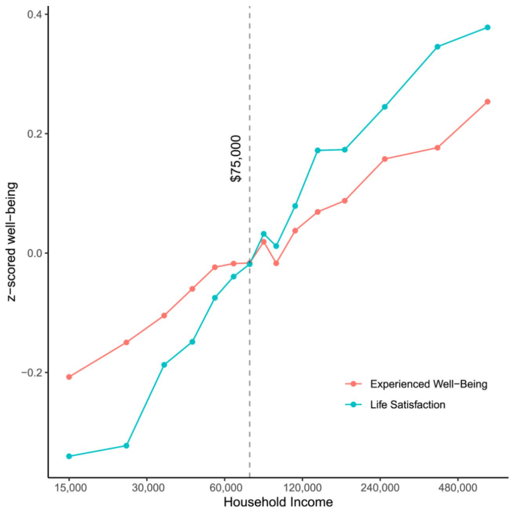
This is the central figure:

Whoa! The paper doesn’t fail to mention (multiple times) how this is virtually a perfect linear relationship between well-being and log(income). The authors conclude that people with higher income are more satisfied with life and experience more well-being!
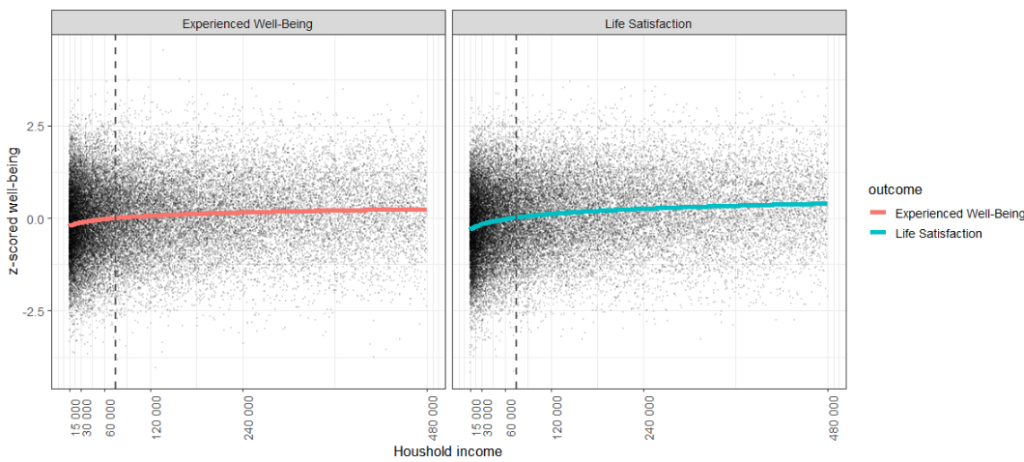
The real-life version of this graph
Let’s see what this graph looks like with a linear x-axis and with simulated raw data (see code below). The black dots are simulated individual participants from the study, assuming that statistical assumptions are met. Their exact distribution along the x-axis is not known (the author did not publish raw data), but that doesn’t matter. It only matters how the dots are dispersed for a given income.

You are one of the black dots. You could be one of the other black dots. But income does virtually nothing to lower or improve people’s well-being or life satisfaction. Income explained 1.5% and 4% of the variance in Well-Being and Life Satisfaction respectively (see code below).
Income explained 1.5% and 4% of the variance in Well-Being and Life Satisfaction respectively
Extreme income rise = extreme happiness?
Let’s study the most extreme case: you have an annual income of just $15,000. But now you get to jump into the life of a rich person all the way to the other side of the (linear) graph with an annual income of $480,000. The result of this 32-fold increase in income is expected to be:
- Life Satisfaction: 62% used to rate higher than you. Now only 35% does! But there’s a 24% chance that you will be less happy than before.
- Experienced Well-Being: 58% used to rate higher than you. Now only 40% does! But there’s a 33% chance that you will be less happy than before.
Hmm, hardly the extreme happiness rush that one might expect would expect from reading the paper and the ensuing media coverage. It’s a vanishingly small effect, considering the extremeness of this example.
Conclusion
I think it’s fairer to say that we’ve now learned that this paper is solid evidence that income is a really poor gauge for happiness. Someone once wrote a song about this:

Code
Computing quantiles and probability of deterioration is simple. The z-score is your score relative to the whole population in units of standard deviations. So just the results for Life Satisfaction were obtained by reading off the extremes of the graph and computing the associated quantiles in R: pnorm(-0.3) and pnorm(0.4). Probability of negative income change is then just pnorm(-0.3, 0.4).
The plots are fairly straightforward too. First, let’s simulate the raw data:
# Data
N = 33391  # Number of participants
incomes = exp(seq(log(15000), log(480000), length.out = N))  # x-axis of Figure 1
trend_wb = seq(-0.2, 0.25, length.out = N)  # Linear, read off Figure 1
trend_ls = seq(-0.3, 0.4, length.out = N)   # Linear, read off Figure 1
z_wb = rnorm(N, trend_wb)  # z-score is standard normal
z_ls = rnorm(N, trend_ls)  # z-score is standard normal

# Merge the data in long format
df = data.frame(
  incomes,
  z = c(rnorm(N, z_wb), rnorm(N, z_ls)),
  outcome = c(rep("Experienced Well-Being", N), rep("Life Satisfaction", N))
)
Now let’s plot it:
ggplot(df, aes(x = incomes, y = z)) +
  geom_point(alpha = 0.1, size = 0.3) +
  geom_line(aes(y = c(trend_wb, trend_ls), color = outcome), lwd = 2) +
  geom_vline(xintercept = 75000, lty = 2, lwd = 1, color = "#555555") +
  facet_wrap(~outcome) +
  #scale_x_continuous(trans = "log", breaks = c(15, 30, 60, 120, 240, 480) * 1000) +
  scale_x_continuous(breaks = c(15, 30, 60, 120, 240, 480) * 1000, labels = scales::label_number_auto()) +
  labs(x = "Houshold income", y = "z-scored well-being") +
  theme_bw(13) +
  theme(axis.text.x = element_text(angle = 90))
If you want to verify other results, you can fit the linear models to the (simulated) data and see that we can approximately replicate the r-values reported in the paper (r = 0.17 and r = 0.09) and that this correspond to 4% and 1.5% variance explained, respectively:
summary(lm(z_ls ~ log(incomes)))
summary(lm(z_wb ~ log(incomes)))
I leave it as an exercise to the reader to filter out nonlow_incomes = incomes[incomes > 30000] and assess the predictive performance (lm(z_ls ~ log(nonlow_incomes)).